
September
I began this series of works on paper while I was delving into indigenous plants in relation to the traditional arts and culture of my home state, Kelantan. As I studied the various techniques of drawing botanical subjects — in pen, graphite, and watercolour — it became clear that botanical drawings require a certain discipline in regard to how the workplace is set up. The tutorials gave practical advice on how to lay out your workstation and the selections of a restrained colour palette. In botanical illustrations, the modus operandi for watercolours is more specialised and rigorous. Practicing wet-in-wet or wet-on-dry technique, I got to know the characters and performance of watercolour papers, their assortment of textures and weights: hot-pressed or cold-pressed, grain fin or grain torchon. Then, the myriad of brushes: sable, Kolinsky or synthetic… Clearly, I’d fallen down a rabbit hole.
Watercolour has always been my medium of choice when making preliminary drawings for larger figurative works. Its fluidity and expressive nature facilitate the smooth flow of ideas. A light material, with a saturation and vibrancy of colours, a transparency and luminosity that make it ideal for studies of future oil paintings.
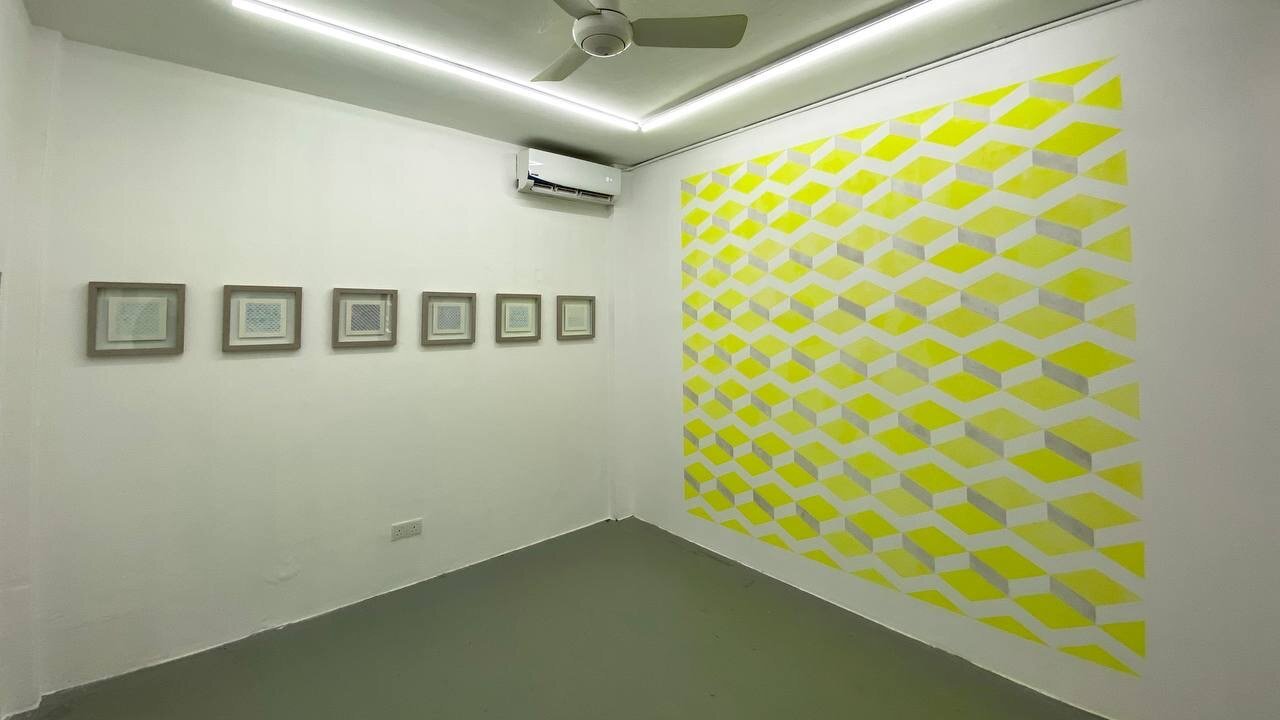
The pattern used repeatedly in this series is a combination of zigzags and diamond lozenge shapes. It is first constructed in a grid formula using pencil, then erased so that the markings are barely perceptible but still visible enough to guide the colours for the structured design. This pattern appeared in my squid series and some larger watercolour and graphite works exhibited in my solo at the Edge Gallery in 2017. The pattern-making process is time-consuming, not the sort of labour that’s meditative. It started off as a sympathetic gesture in perseverance but later grew into an obsession.
I was also thinking about alternative ways that I could share my works publicly and navigating different social media platforms. Mireille Mosler sent me an exhibition catalogue of drawings published on Issuu (Bring your digital content to life) — I found this attractive, as the flipbook was a pleasant way of viewing the works, akin to leafing through a physical catalogue. Browsing at this pace is, for me, much more preferable than a virtual exhibition room viewing, which feels like playing the video game Doom. I toyed with the name ‘September issuu’ for my exhibition — pun intended, referencing the “September issue” of American Vogue, which I used to follow.
September begins with ‘sky blue’, a piece made for the exhibition Karyakata at RumahLukis, which showcased a thematic selection of artworks in the collection of Pital Maarof. Artists and friends of RumahLukis were asked for an anecdote or quote relating to any of the works on display. I decided on ‘Cerulean Blue’, a small oil on linen painting of a squeezed oil tube, painted for my solo xxv (2010) which featured still lives and portraits. Instead of writing about the work, I decided to submit my thoughts on paper in watercolour. Cerulean blue is a favourite colour of mine. Ralph Mayer, in The Artist’s Handbook of Materials and Techniques, provided a brief history: “A bright sky blue, quite opaque. Permanent for all uses. Known as early as 1805. Introduced by George Rowney, England, in 1870 under the name of Coereleum, derived from caeruleum, Latin for sky-blue pigment, applied by the Romans mainly to Egyptian blue.” From that initial piece, the exercise grew and continued with variations of the same pattern, differing only in lightness of wash or colour.
‘sky blue’ evolves into ‘blue sky’. One describes colour while the other describes a state of mind or a weather condition. Blue skies: everything is nice. A mental attitude. Adding a warm yellow on the zigzag pattern gives dimensionality to an otherwise flat pattern. ‘indigo’ reminded me of the natural dye, popular for batik and denim colouring.
The ‘wow’ triplets are associated with landscape and nature, as inspired by the view from my studio, which overlooks a thick and tangled growth of verdant trees and underbrush. I have always wanted to paint this scenery, but the task is quite daunting — so many leaves! “Wow” could also be an expression of wonder, a surprise or a sigh.
Reading Dave Hickey’s essay ‘Pontormo’s Rainbow’ in his book Air Guitar: Essays on Art & Democracy led me to research Isaac Newton’s Opticks, a book on prisms and the colours of the rainbow: red, orange, yellow, green, blue, indigo, and violet. With these hues in mind, I combined the seven days of the week with the seven colours to create the Blue Monday paintings — ‘cerulean blue monday’ and ‘cobalt blue monday’, tributes to the track by New Order. The rest of the weekdays and their assigned pigments remain in my sketchbook for the moment.
‘nocturne i’ refers to the mural by Giotto in the Scrovegni Chapel in Padua, presumably painted between 1303–05. I have visited it several times during my intermittent sojourns in Italy. Of all the frescoes adorning the rectangular hall of the chapel, I find the cobalt blue barrel vault ceiling studded with golden stars the most spectacular. ‘nocturne ii’, rendered in cobalt blue and metallic silver, is a tribute to Karl Friederich Schinkel’s 1816 stage set design for the Hall of Stars in the Palace of the Queen of the Night scene in Mozart’s opera Die Zauberflöte. Perhaps Schinkel was inspired by Giotto’s deep blue sky too.
What started as an amusing diversion turned into a serial preoccupation. This fluid, luscious, and unforgiving medium continues to seduce me. A large order has just arrived for me, containing stacks of bigger and heavier cold-pressed watercolour paper. Fingers crossed for further experiments and happy meanderings. xx
Noor Mahnun

About the Artist
Noor Mahnun Mohamed graduated with a Masters in Fine Art from the Hochschule für Bildende Künste in Braunschweig, Germany in 1996. Since then, her artistic practice has continued to take her all over the world. In 2000, she was the Malaysian artist-in-residence at Rimbun Dahan in Kuang, Selangor. She was awarded the Italian Government Scholarship in 2003 to study printmaking at the International School of Print and Graphic Il Bisonte in Florence, Italy. In 2005 she was selected for the Australian High Commission in Kuala Lumpur’s Visual Arts Residency at Gunnery Studio, Sydney, Australia. From 2012–13, she researched printmaking in Japan as an Asian Public Intellectual under the Nippon Foundation Grant.
From 2003–05, she was a curator at Valentine Willie Fine Art and from 2006–12 she was the Arts Manager of the Rimbun Dahan Art Residency programme. She has taught Art Criticism and Professional Studies at the Malaysian Institute of Art and courses in Visual Communication and Design at the University of Malaya, both in Kuala Lumpur. Currently, she teaches Art Curatorship at UiTM Shah Alam, Selangor. As a painter, she has had several solo and group exhibitions, locally and abroad. Noor Mahnun is known for adapting the traditional technique of oil painting into a style that has been praised for its simplicity and meticulousness. Beneath their guise of naïvety and delicacy are carefully crafted works that weave subtle psychological narratives with a dark wit and emotional depth.